102 designs for one website

Every design is the complete bilingual site – home, imprint and privacy, in German and English – with the same content. Open one and leaf through with the ← / → keys or the bar at the bottom left; it keeps the page and the language you are on.

Start browsing
  1. 001

    Chapters

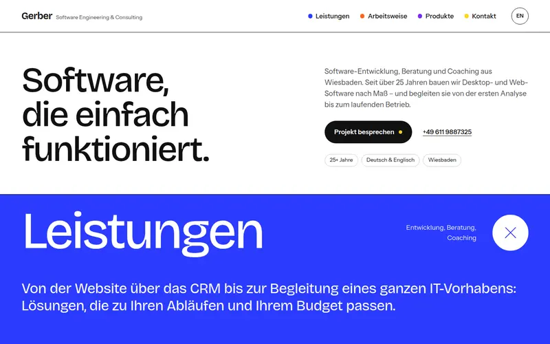
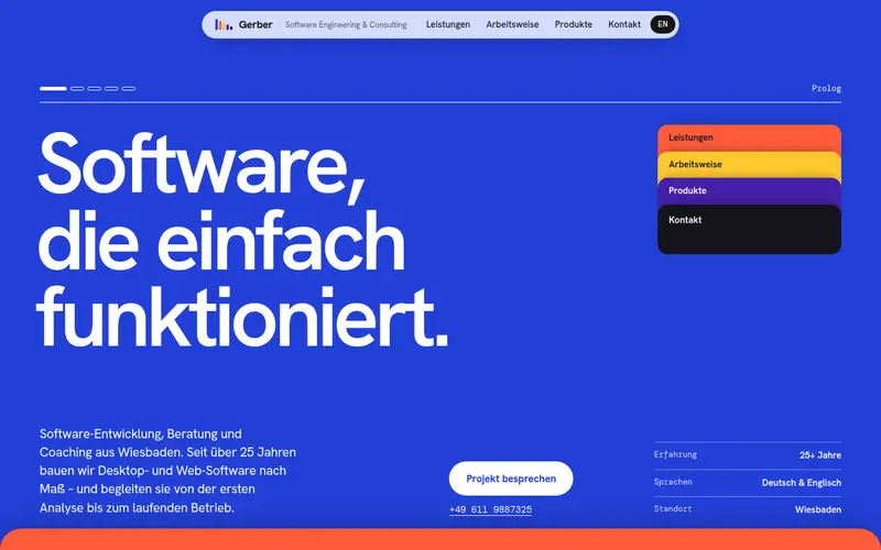
    Five full-screen chapters in flat cobalt, tomato, sunflower, violet and ink that slide over each other like a stack of cards.

  2. 002

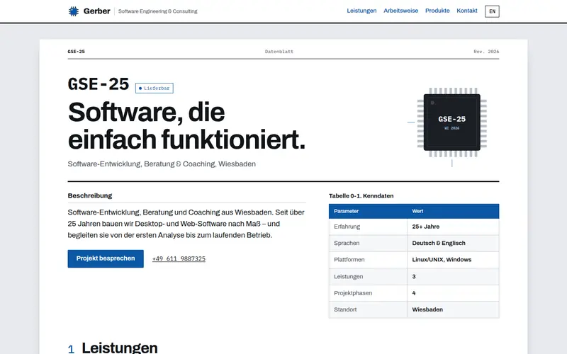
    Datasheet

    The company documented like an electronics component datasheet: part number GSE-25, features, block diagram, pin configuration and ordering table.

  3. 003

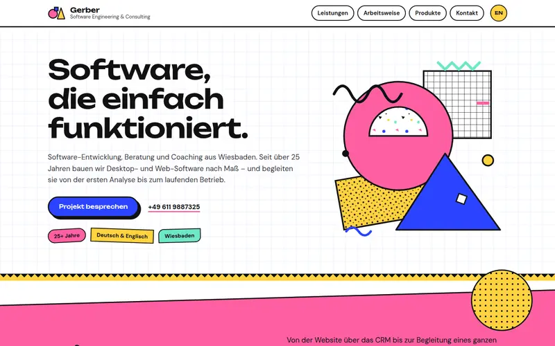
    Memphis

    A joyful 1980s Memphis Milano page: confetti squiggles, zigzags and terrazzo dots in pink, yellow and cobalt with thick black outlines, on tilted colour boards.

  4. 004

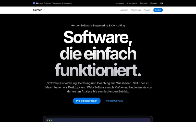
    Launch

    An Apple-style product launch: alternating black and white bands, enormous centred headlines and each service revealed with a large CSS-drawn product visual.

  5. 005

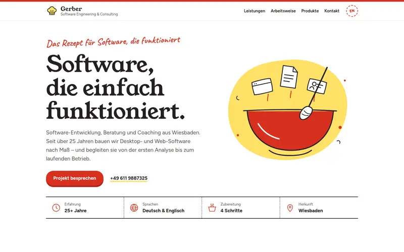
    Recipe

    The recipe for software that works: a modern cookbook spread in bright white, paprika red and butter yellow with ingredients, method, kitchen tips and hand-drawn icons.

  6. 006

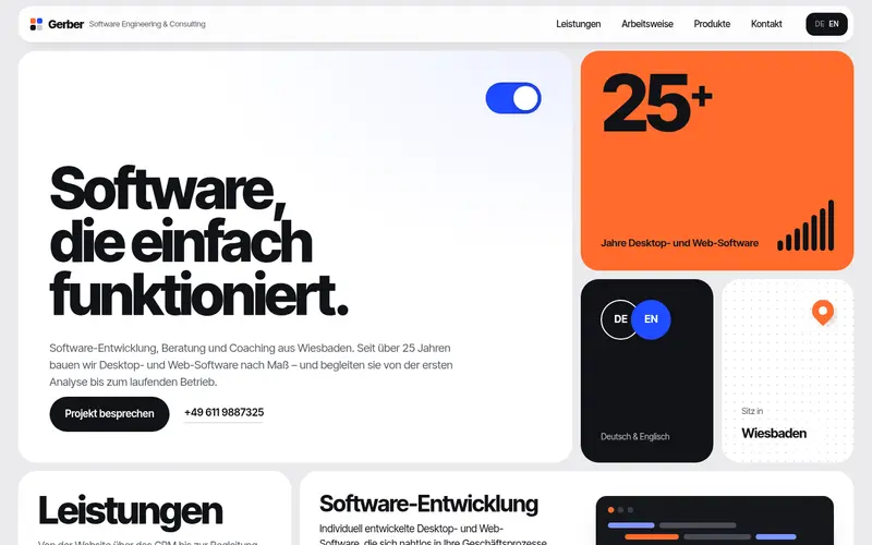
    Bento

    The whole page is one continuous bento grid of white and saturated tiles – hero, services, phases, products and contact as a dense, keynote-style mosaic.

  7. 007

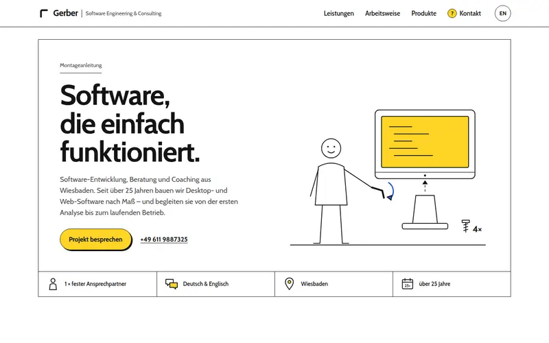
    Manual

    A friendly assembly manual: line-drawn figures and parts, a numbered contents list for the services, big step panels for the four phases and a “?” helpline for contact.

  8. 008

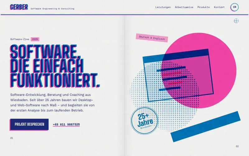
    Riso

    A risograph-printed zine in fluorescent pink and blue: overprinted shapes, halftone dots, slight misregistration and big condensed headlines laid out as spreads.

  9. 009

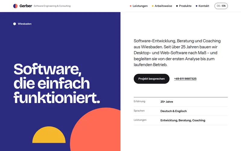
    Split

    Every section is a 50/50 split screen: a sticky full-height colour field with the large title on one side, the content scrolling on the other – alternating sides and colours.

  10. 010

    Constellation

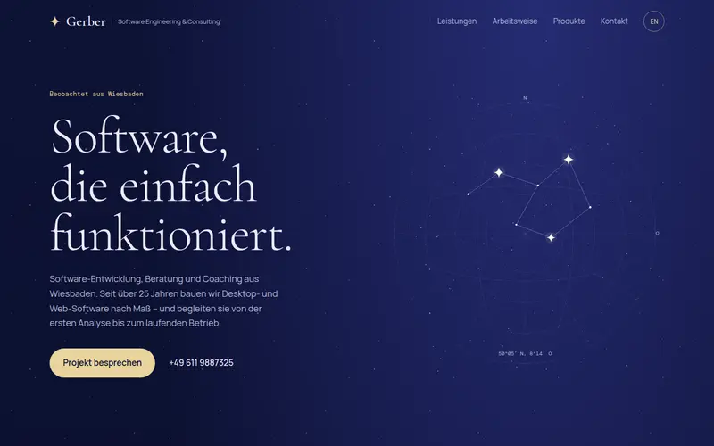
    A calm night sky in deep indigo: the services drawn as constellations, the four phases as a path across a star chart, products as planets in orbit.

  11. 011

    Accordion

    The whole page as a stack of giant full-width accordion rows in medium-weight type – each row opens into its own vivid colour band with a rich layout inside.

  12. 012

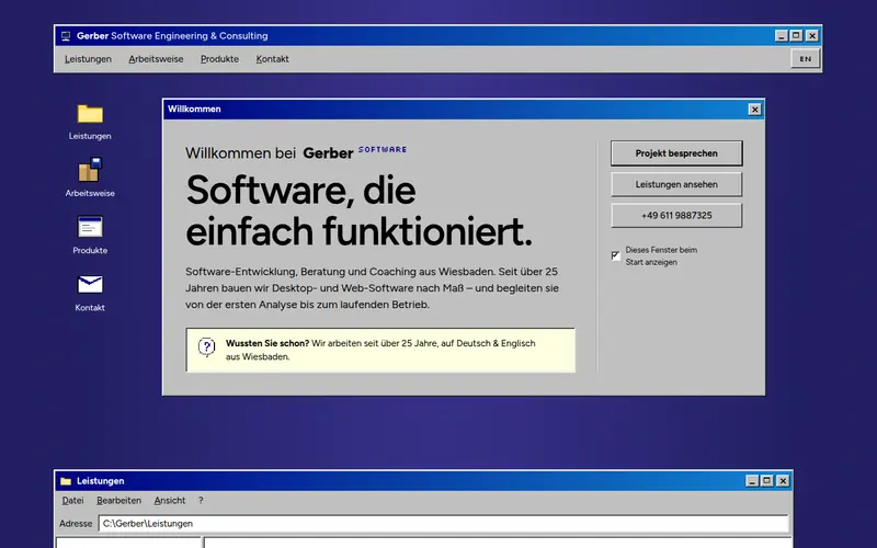
    System

    A retro 90s desktop OS on a deep indigo desktop: every section is a bevelled window – file explorer, setup wizard, program icons, dialog boxes, a Properties sheet – with a taskbar and Start menu as footer.

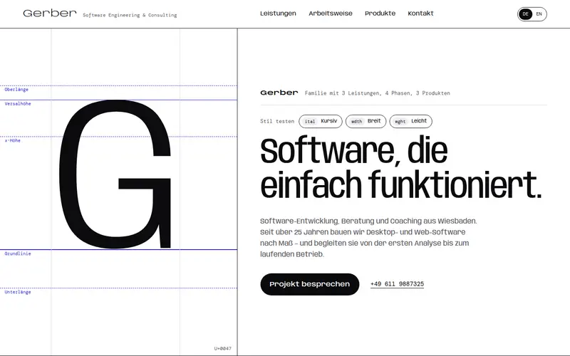
  13. 013

    Specimen

    The company presented like a type-foundry specimen: a giant measured “G”, a weight ladder, services as specimen lines at descending sizes, a waterfall of the four phases and a live style tester – black on white with one ultramarine accent.

  14. 014

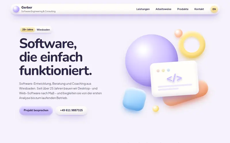
    Clay

    Soft 3D claymorphism: inflated pastel shapes in lavender, peach, sky blue and butter, squishy service tiles with sculpted icons, phases as pebbles on a path, products as clay objects on pedestals and pill buttons that press in.

  15. 015

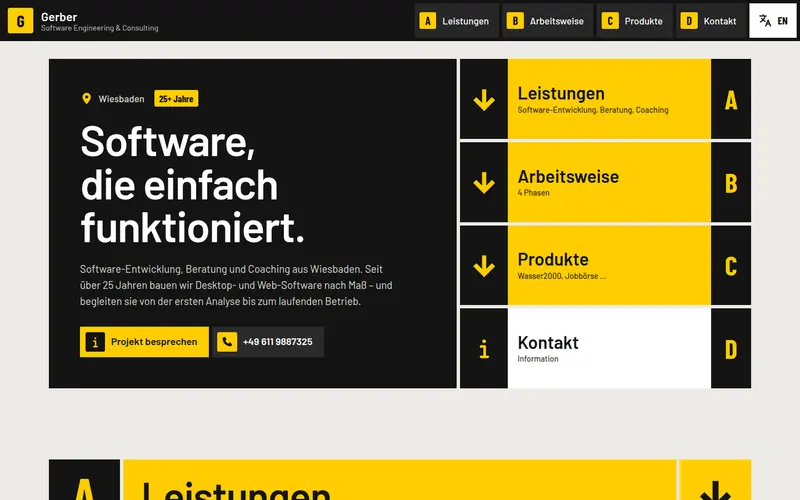
    Wayfinding

    An airport-style wayfinding system as a website: black and signal-yellow sign panels on a strict grid, consistent pictograms, area letters A–D for the sections, direction signs as navigation, the phases as a route with stops and contact as an information desk.

  16. 016

    Workspace

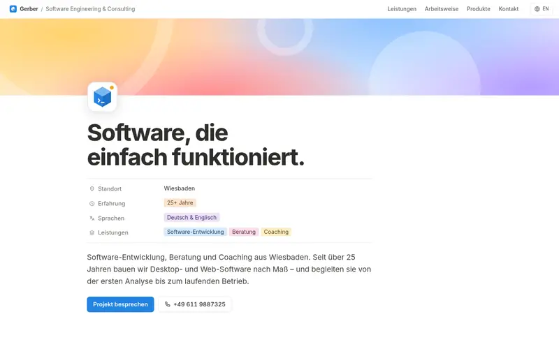
    The website as a tidy workspace document: colourful cover, page icon and properties, toggle lists for the services, a board view for the four phases and a database table for the products.

  17. 017

    Deco

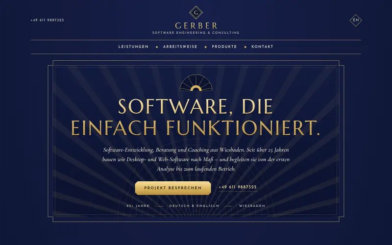
    Art Deco grand-hotel poster in midnight navy and gold: sunbursts, stepped frames, arched service frames, a ziggurat of phases and framed product plaques.

  18. 018

    Comic

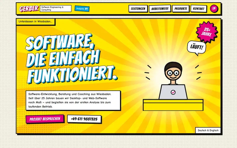
    The page as a comic book: splash-page hero with a title burst, service panels with speech bubbles, a four-panel project strip and retro product ads.

  19. 019

    Nordic

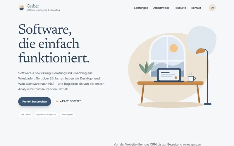
    Calm Scandinavian contemporary: cool off-white, slate blue, sand and warm wood, soft blob shapes, a staggered airy layout and gentle illustrated scenes.

  20. 020

    Chrome

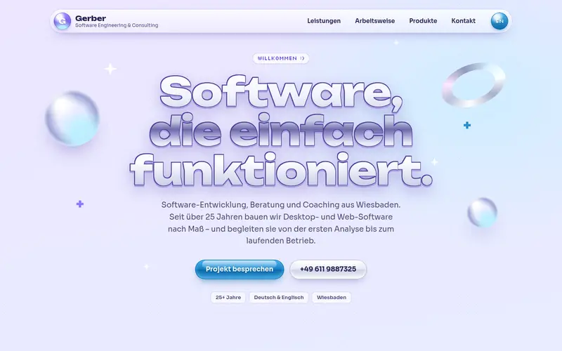
    Y2K chrome nostalgia: bubbly chrome headline, sparkles, glossy aqua pills and glass panels, an installer-style progress bar and products as shiny discs.

  21. 021

    Mondrian

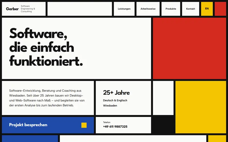
    The whole page as one De Stijl composition: thick black grid lines, red, blue and yellow blocks and white cells that carry the content.

  22. 022

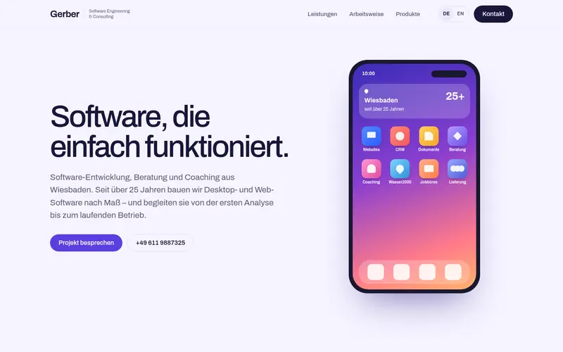
    Motion

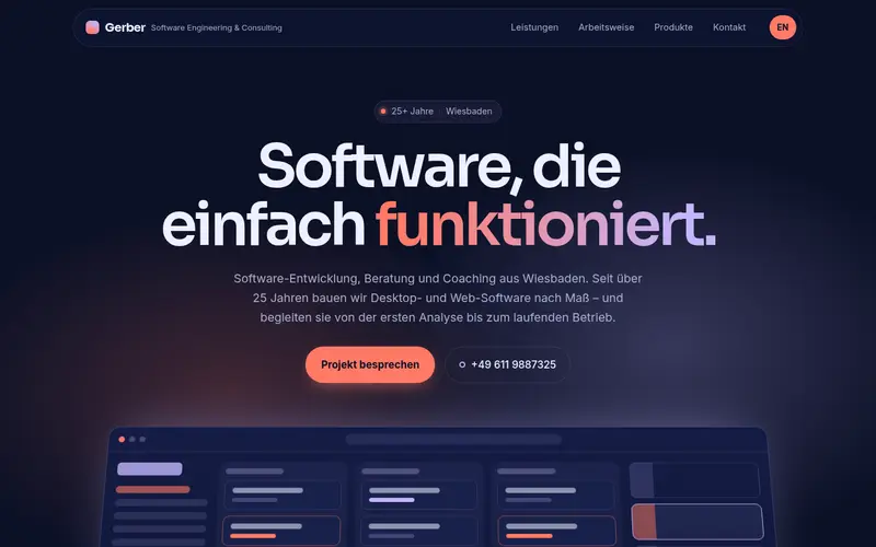
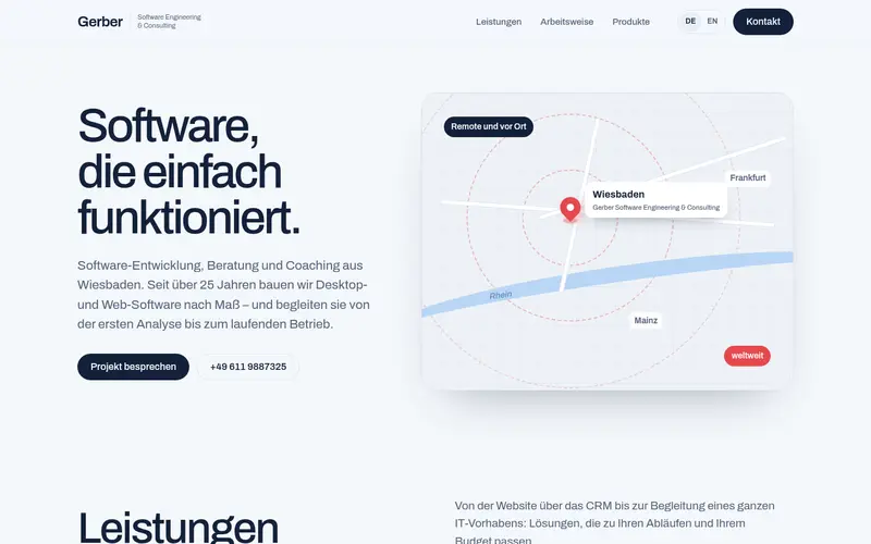
    A calm dark-navy product site with coral and lilac, a word-by-word hero and one scroll-driven stage where the four phases advance as you scroll.

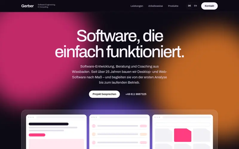
  23. 023

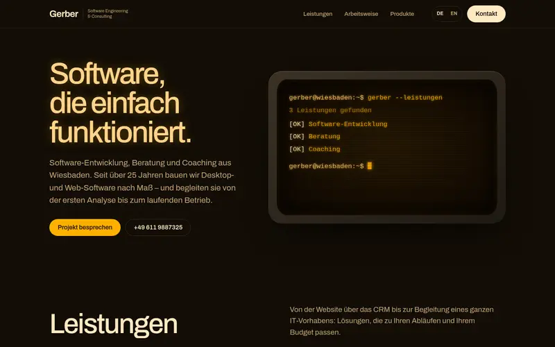
    Pinboard

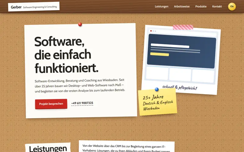
    A warm corkboard: pinned paper notes, index cards and polaroids of the products, washi tape and a red string through the four phases.

  24. 024

    Collage

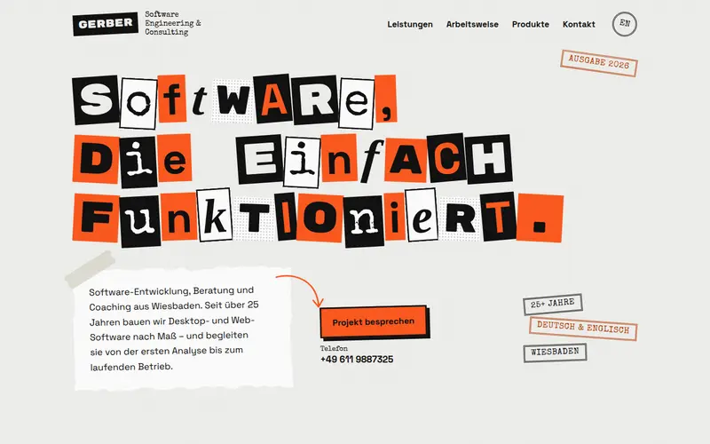
    A photocopied punk zine in black and white with one hot orange: ransom-note headline, torn paper, tape, stamps and hand-drawn arrows, with calm, legible body text.

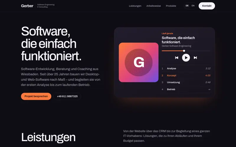
  25. 025

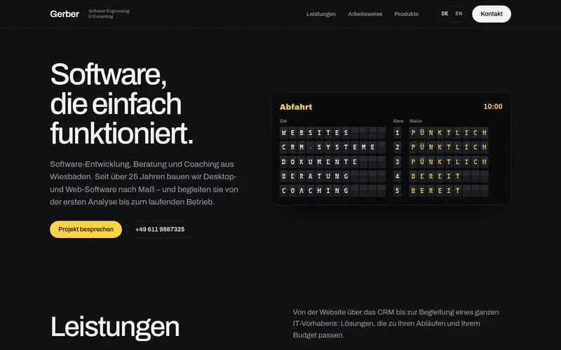
    Material

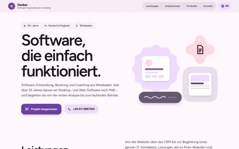
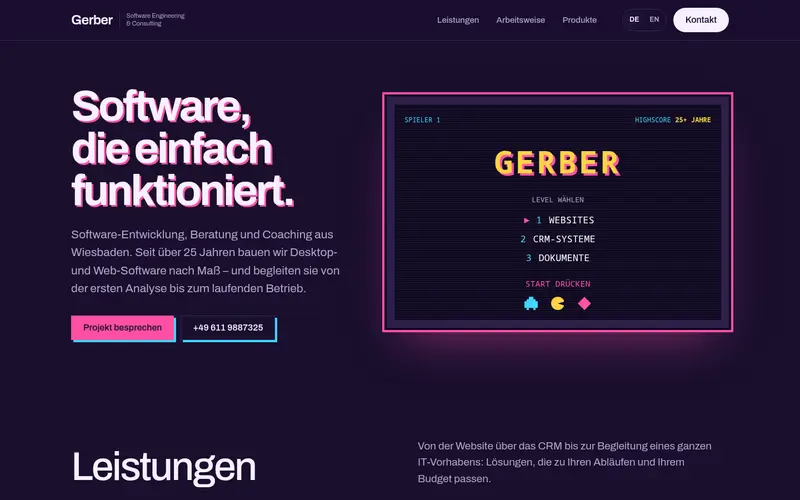
    Material 3 Expressive with a warm violet tonal palette: big morphing cookie and clover shapes, an extended FAB, segmented buttons, chips and cards with large, varied radii.

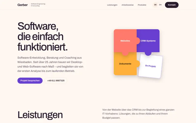
  26. 026

    Neo-Brutal

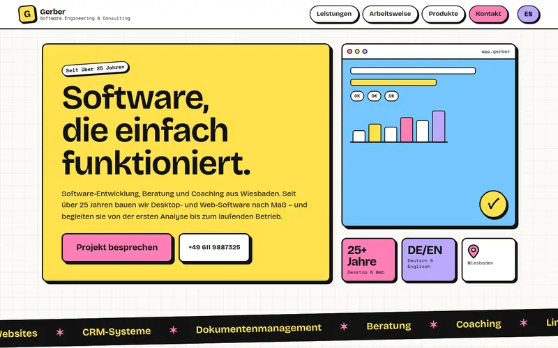
    Loud and playful neo-brutalism: thick black outlines, hard offset shadows, flat lemon, pink, sky and lilac blocks and big buttons that press in when you touch them.

  27. 027

    Package

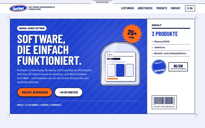
    The website as a bold retail box in cobalt and orange: front panel with the claim, a nutrition-facts label for every service, preparation steps, three product packs and a manufacturer panel with barcode.

  28. 028

    Topo

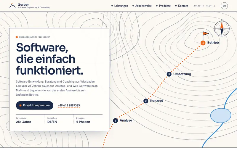
    A topographic map in navy contour lines on warm white: the project as a hiking route from trailhead to summit with an elevation profile, services as the map legend and products as points of interest.

  29. 029

    Panes

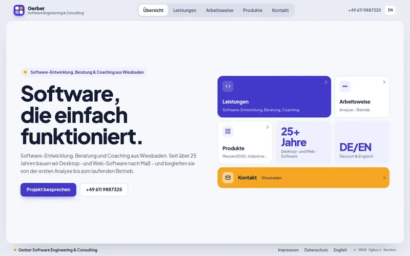
    An app-like one-screen website in indigo and amber: the tabs switch between full panels (overview, split service view, stepper, master–detail products, contact card) and fall back to normal scrolling on phones.

  30. 030

    Museum

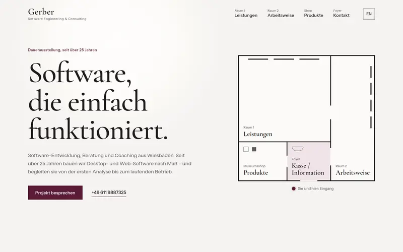
    The company as a quiet, elegant exhibition: a floor plan as navigation, services as exhibits with museum wall labels, products on lit plinths in the museum shop and contact at the information desk.

  31. 031

    Cobalt

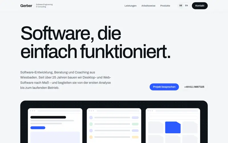
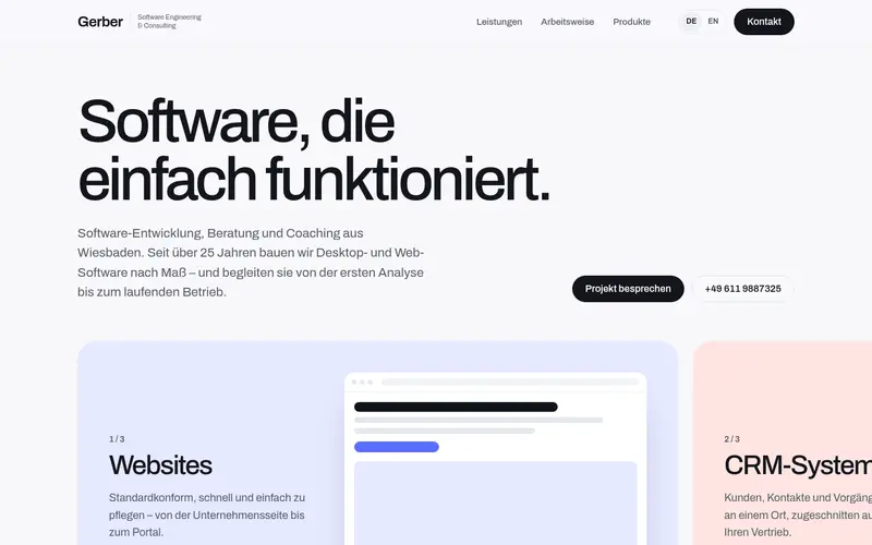
    Light and airy: large regular-weight grotesk, one cobalt accent, a dark hero panel and rounded cards.

  32. 032

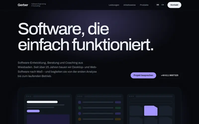
    Midnight

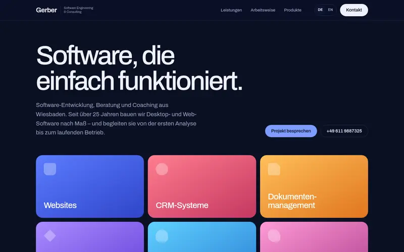
    Dark and premium, like a modern developer tool: near-black surfaces, a soft violet glow, fine outlines.

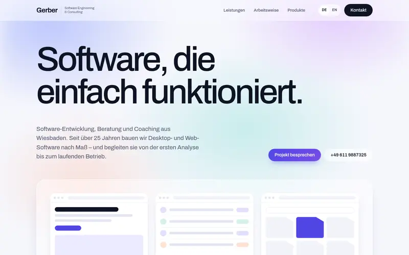
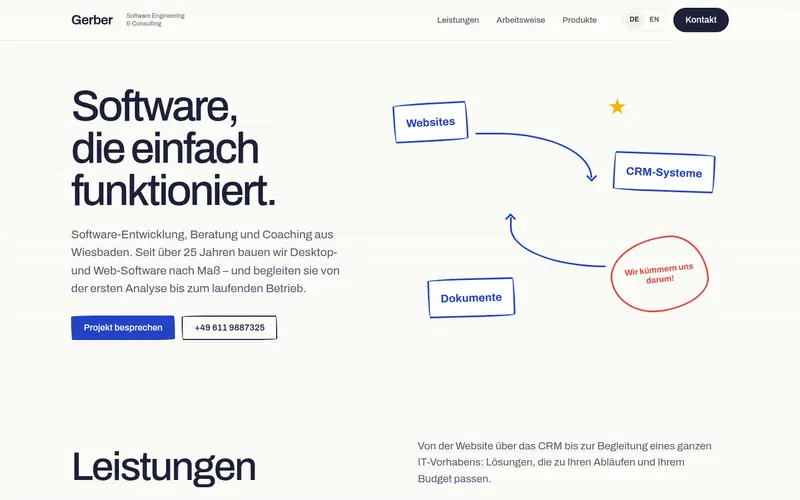
  33. 033

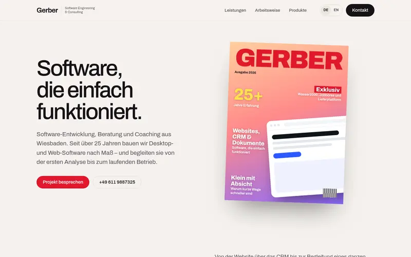
    Aurora

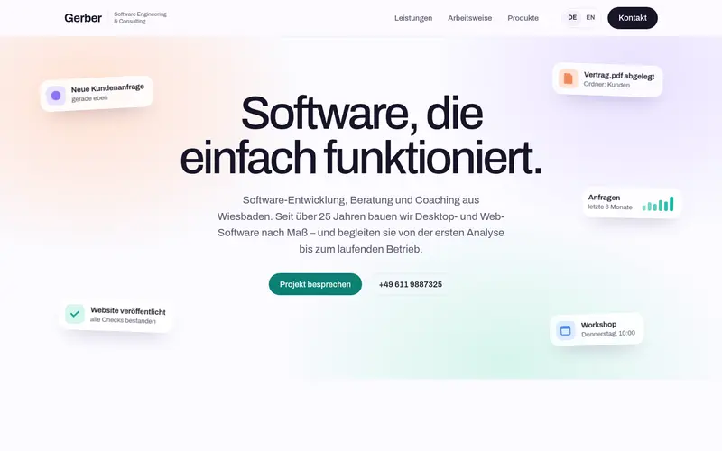
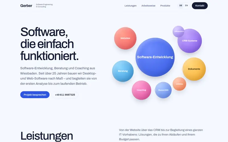
    Light and friendly: soft colour gradients behind the hero, frosted-glass cards, an indigo accent.

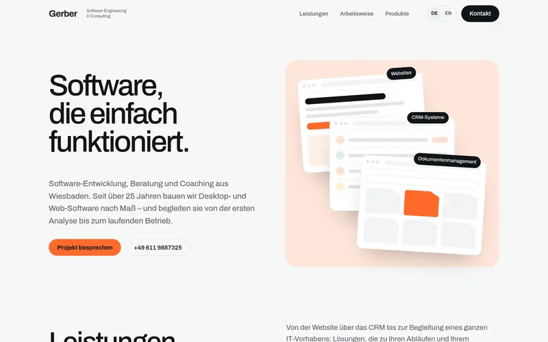
  34. 034

    Stack

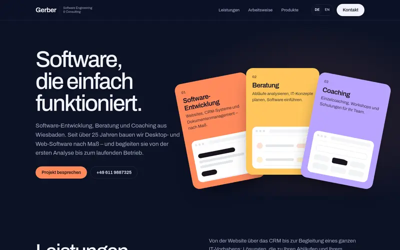
    A different layout: split hero with the three product windows fanned out beside the headline; orange accent.

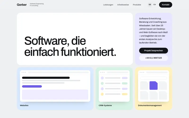
  35. 035

    Mosaic

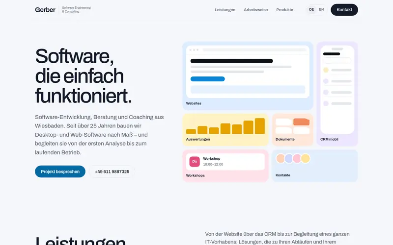
    The hero becomes a grid of tiles: headline, intro and each product window in its own pastel tile.

  36. 036

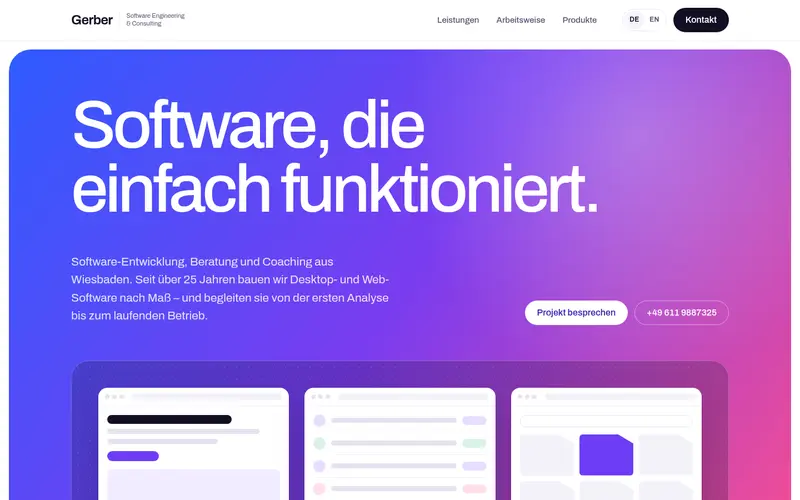
    Vivid

    Energetic: a saturated blue-violet-pink gradient hero in a rounded card, white type, glassy product panel.

  37. 037

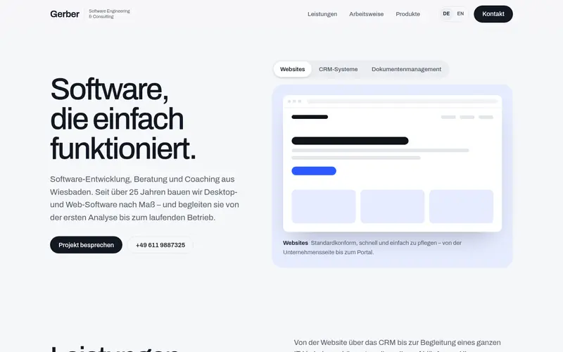
    Showcase

    Interactive hero: tabs for Websites, CRM and Document management switch a large app preview (CSS only).

  38. 038

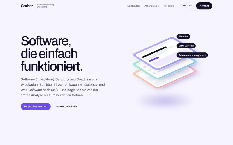
    Layers

    A floating 3D stack of glass layers – website, CRM, documents – that spread apart on hover.

  39. 039

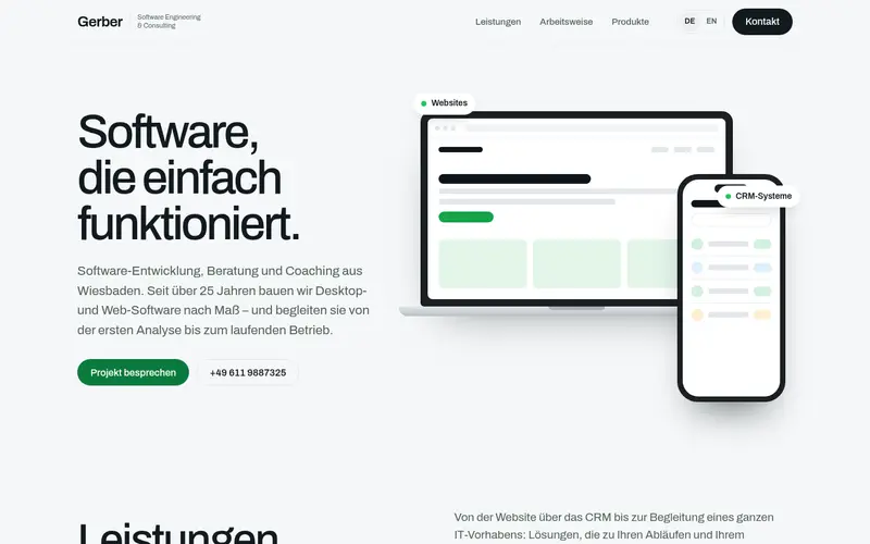
    Devices

    Product-led: a laptop with a website and a phone with a CRM in front of it, all drawn in CSS; green accent.

  40. 040

    Dashboard

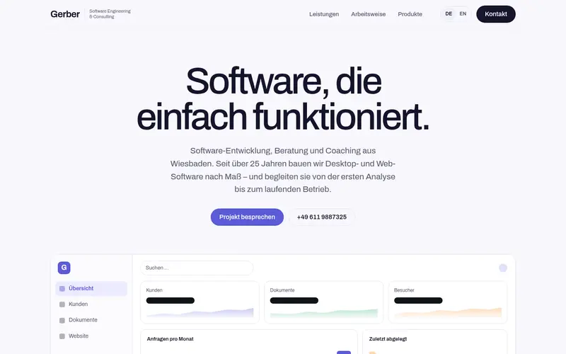
    Centred headline above a wide app dashboard – navigation, tiles, chart, customer list and documents.

  41. 041

    Float

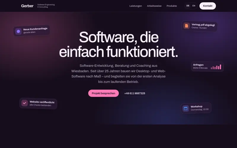
    Centred headline surrounded by gently floating interface snippets: enquiry, document, website, workshop.

  42. 042

    Prism

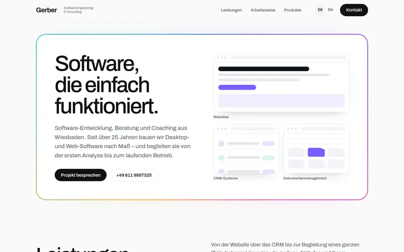
    The hero inside a large card with a slowly rotating rainbow gradient border; gradient edges on the cards.

  43. 043

    Sunset

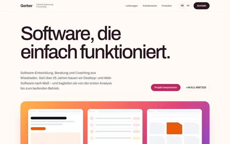
    Warm and light: Cobalt’s layout with a dusk gradient hero panel – amber, coral, magenta, violet.

  44. 044

    Peach

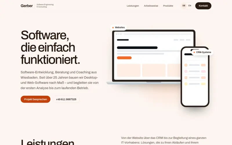
    Warm and light: the Devices hero (laptop and phone) on soft peach with a deep orange accent.

  45. 045

    Copper

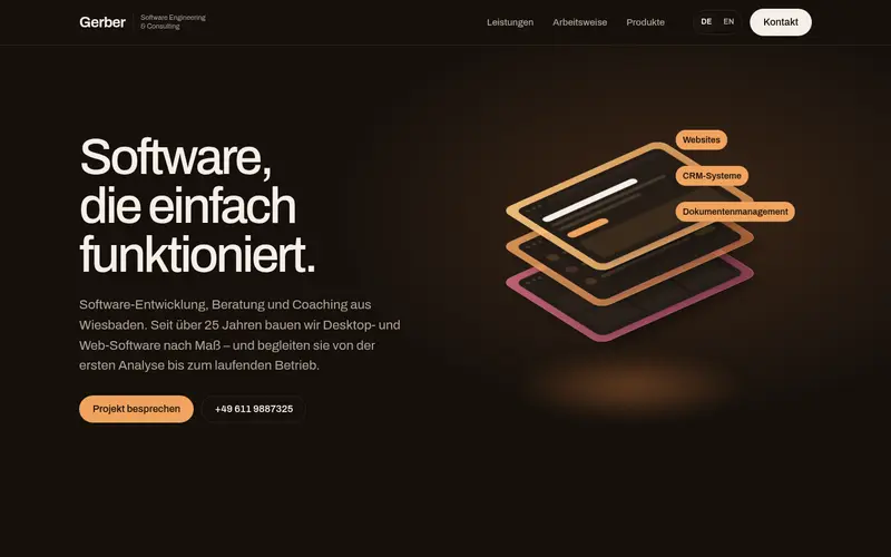
    Warm and dark: the Layers 3D glass stack in copper, amber and rose on brown-black.

  46. 046

    Noir

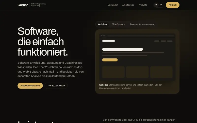
    Warm and dark: the Showcase tabbed hero on near-black with gold.

  47. 047

    Obsidian

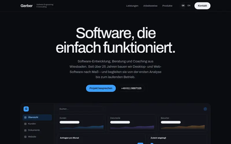
    Dark and cool: the Dashboard hero in full dark mode with an electric blue accent.

  48. 048

    Plum

    Dark: the Float hero as dark glass snippets on deep plum with pink glows.

  49. 049

    Slides

    Colourful and light: a swipeable carousel with one large slide per focus area, each in its own colour.

  50. 050

    Deck

    Dark navy with warm cards: the three services fanned out like a hand of cards; hover lifts a card.

  51. 051

    Wall

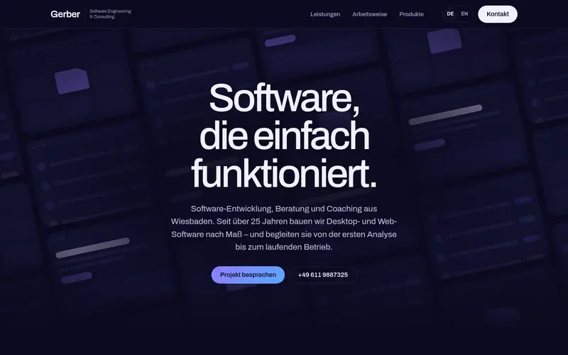
    Dark indigo: a tilted wall of app windows drifts in columns behind the headline.

  52. 052

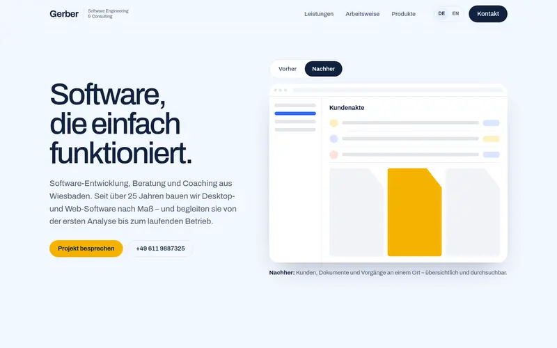
    Switch

    Light blue and sunny yellow: a Before/After toggle – scattered spreadsheets and notes vs. one tidy app.

  53. 053

    Callouts

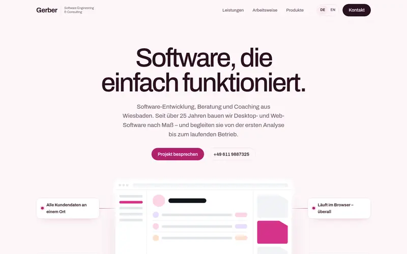
    Blush and berry: a large app window annotated with four feature callouts connected by thin lines.

  54. 054

    Panels

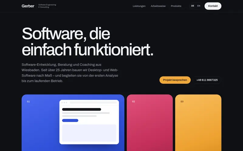
    Dark with jewel tones: three tall panels – sapphire, ruby, amber – that expand on hover or focus.

  55. 056

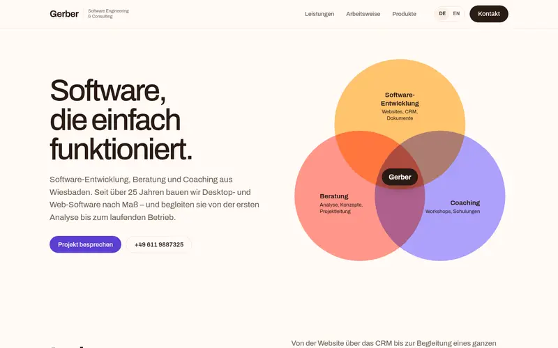
    Venn

    Warm: three overlapping circles – development, consulting, coaching – with Gerber at the centre.

  56. 057

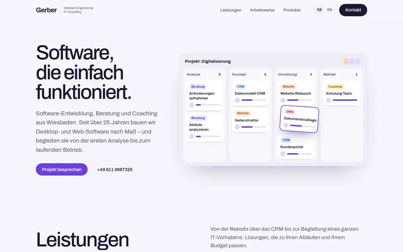
    Kanban

    Light with a violet accent: a project board from analysis to operation, one card mid-drag.

  57. 058

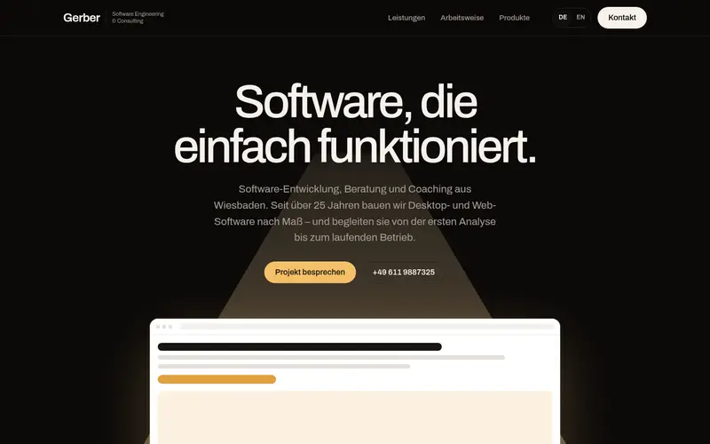
    Spotlight

    Dark stage: a warm beam of light falls on a single app window that reflects on the floor.

  58. 059

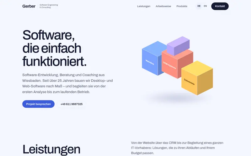
    Blocks

    Three isometric 3D cubes – Websites, CRM, Documents – floating in pastel.

  59. 060

    Metro

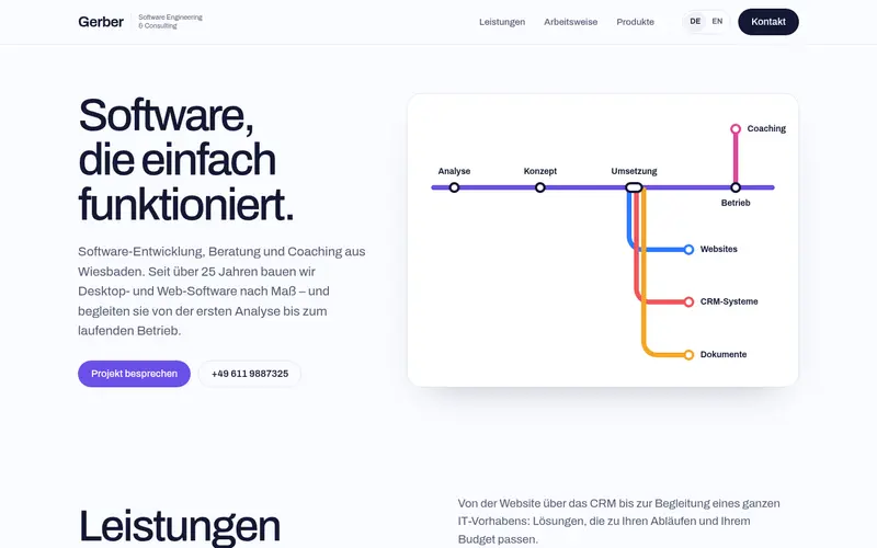
    The work as a subway map: a main line from analysis to operation, branching to the focus areas.

  60. 061

    Ticket

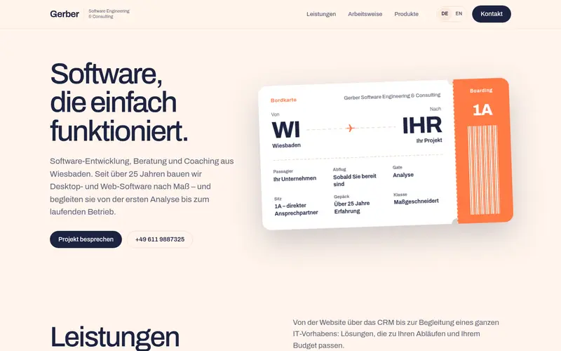
    A boarding pass from Wiesbaden to your project – gate, seat, baggage, perforation and barcode.

  61. 062

    Flip

    Six cards that flip over on hover or focus to reveal the details; dark navy.

  62. 063

    Sphere

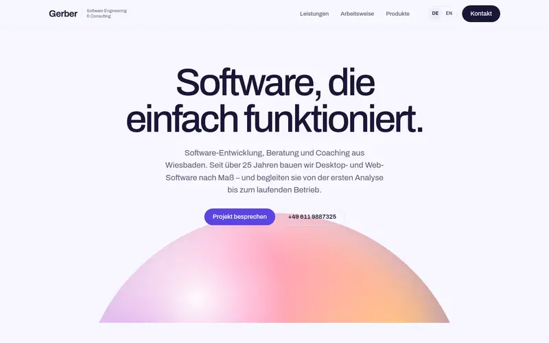
    A huge iridescent sphere rising like a planet beneath the headline.

  63. 064

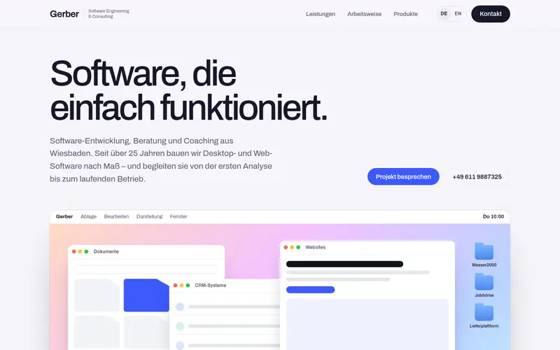
    Desktop

    The hero as a computer desktop: menu bar, wallpaper, app windows, product icons and a dock.

  64. 065

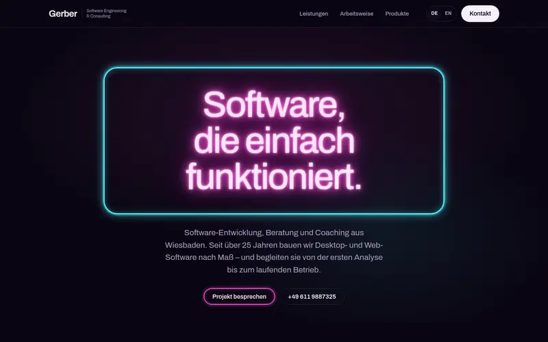
    Neon

    A glowing neon-sign headline in a neon frame on a dark wall; pink and cyan.

  65. 066

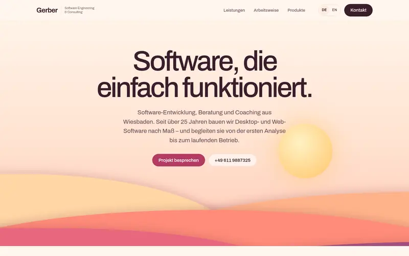
    Paper

    A paper-cut sunset landscape of layered hills and a sun in warm tones.

  66. 067

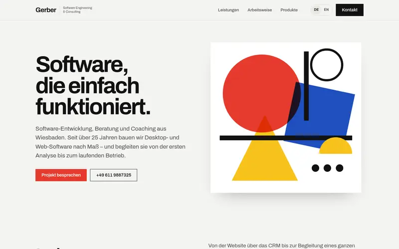
    Bauhaus

    A geometric poster composition in red, yellow, blue and black – a nod to German design.

  67. 068

    Homescreen

    A phone home screen whose app icons are the services and products.

  68. 069

    Map

    A stylised map with the Rhine, Wiesbaden, Mainz and Frankfurt, a pulsing pin and remote rings.

  69. 070

    Lava

    Huge morphing colour blobs drift behind the headline on dark, with a glass panel of app windows.

  70. 071

    CRT

    A retro amber terminal on a curved CRT screen, listing the services as command output.

  71. 072

    Gazette

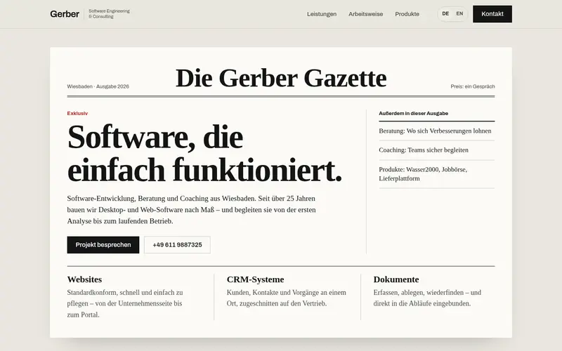
    The home page as a newspaper front page: masthead, lead story, columns and a sidebar.

  72. 073

    Receipt

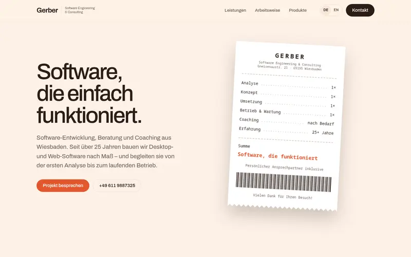
    A shop receipt itemising the work – analysis to operation – with “software that works” as the total.

  73. 074

    Postcard

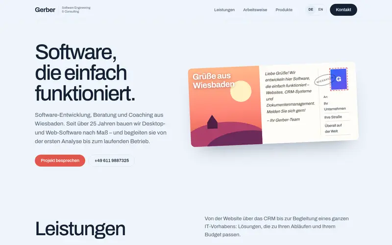
    A postcard “Greetings from Wiesbaden” with stamp, postmark and a short message.

  74. 075

    Floppy

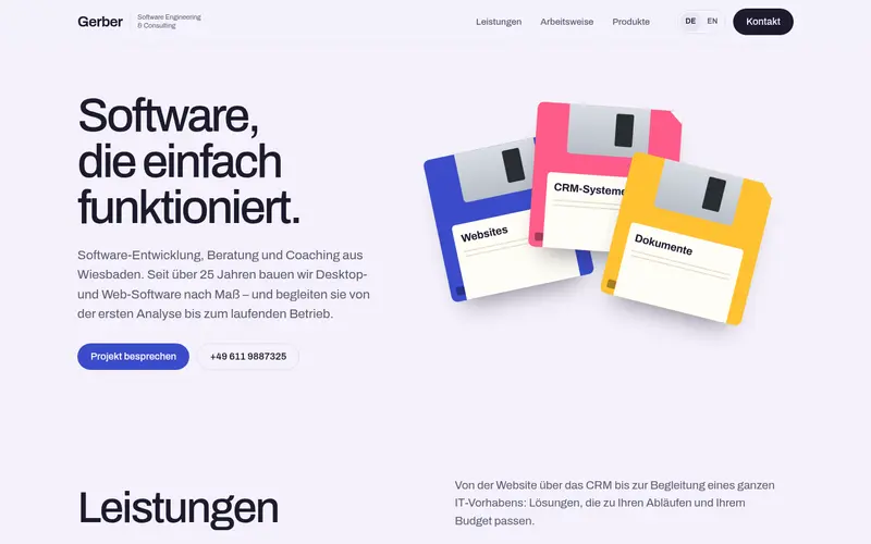
    Three colourful 3.5-inch floppy disks labelled Websites, CRM and Documents.

  75. 076

    Player

    A music player: the headline as “now playing” and the four project stages as the track list.

  76. 077

    Flapboard

    A split-flap departure board: the services depart on time from platforms 1–5.

  77. 078

    Arcade

    An 8-bit game screen: press start, select a level, high score 25+ years.

  78. 079

    Puzzle

    Interlocking puzzle pieces – Websites, CRM, Documents – with “your project” as the piece that completes it.

  79. 080

    Wallet

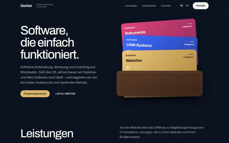
    A wallet with a fanned set of cards, one per focus area, each with chip and validity “unlimited”.

  80. 081

    Gauges

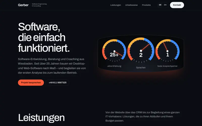
    A car-style instrument cluster: 25+ years, 2 languages, 1 dedicated contact.

  81. 082

    Origami

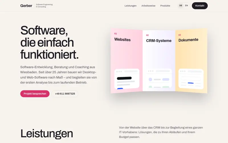
    A folded paper leaflet: three creased panels, one per focus area.

  82. 083

    Keys

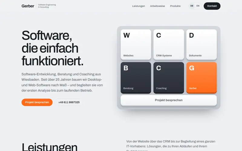
    Chunky mechanical keycaps for each service, with the space bar as the call to action.

  83. 084

    Radar

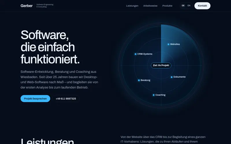
    A sweeping radar screen with the services as blips, locked on to “your project”.

  84. 085

    Elements

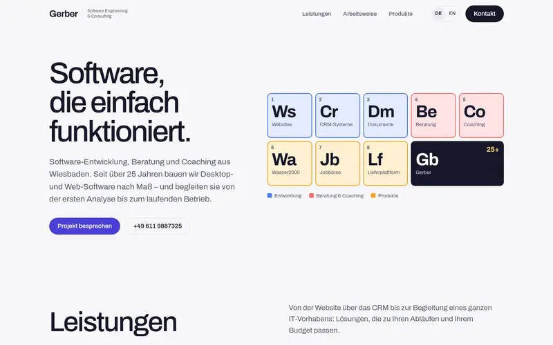
    A periodic table of the services and products, with Gerber 25+ as the core element.

  85. 086

    Crossword

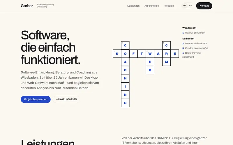
    A crossword puzzle whose answers are Software, Web, CRM and Coaching, with clues.

  86. 087

    Calendar

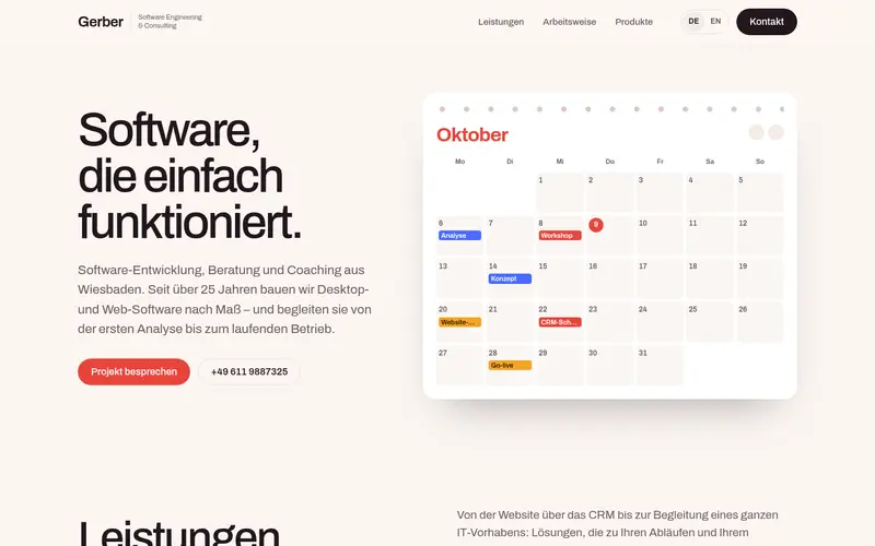
    A wall calendar for October with project dates – analysis, workshop, relaunch, go-live.

  87. 088

    Inbox

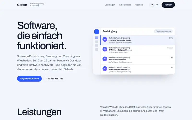
    An email client full of good news from projects: website live, CRM imported, documents archived.

  88. 089

    Browser

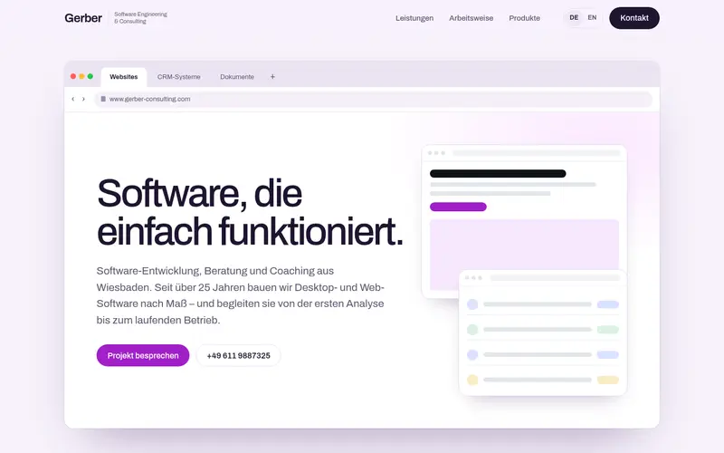
    The whole hero inside a large browser window, with the focus areas as tabs.

  89. 090

    Spreadsheet

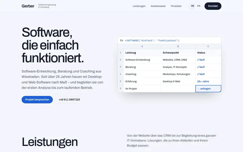
    A spreadsheet of the services with the formula =SOFTWARE("just"; "works").

  90. 091

    Folders

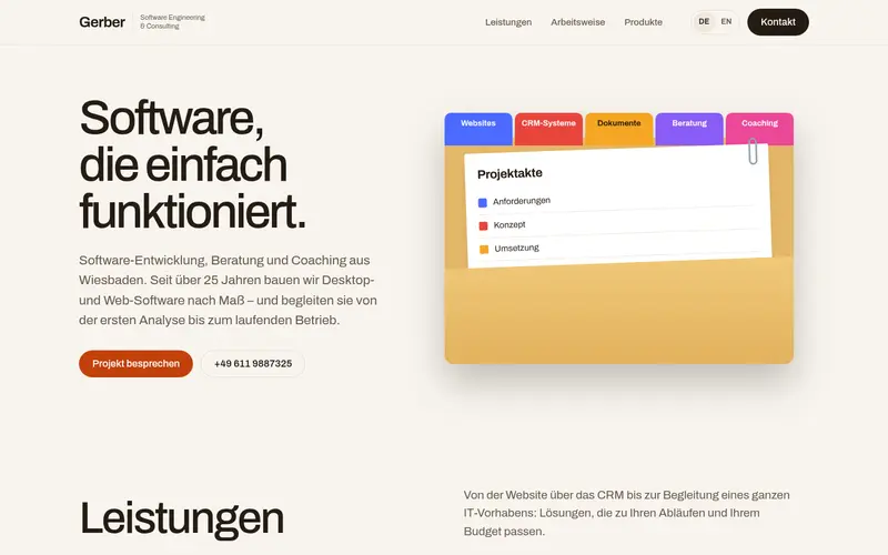
    A file folder with coloured index tabs for each service and an open project file.

  91. 092

    Checklist

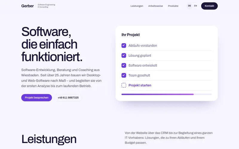
    A checklist that ticks itself off – the last item “Start your project” links to contact.

  92. 093

    City

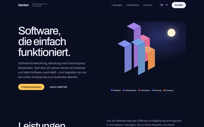
    An isometric night city: one lit tower per service under the moon.

  93. 094

    Ring

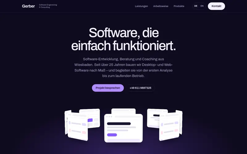
    A 3D carousel of app windows rotating slowly beneath the headline.

  94. 095

    Outline

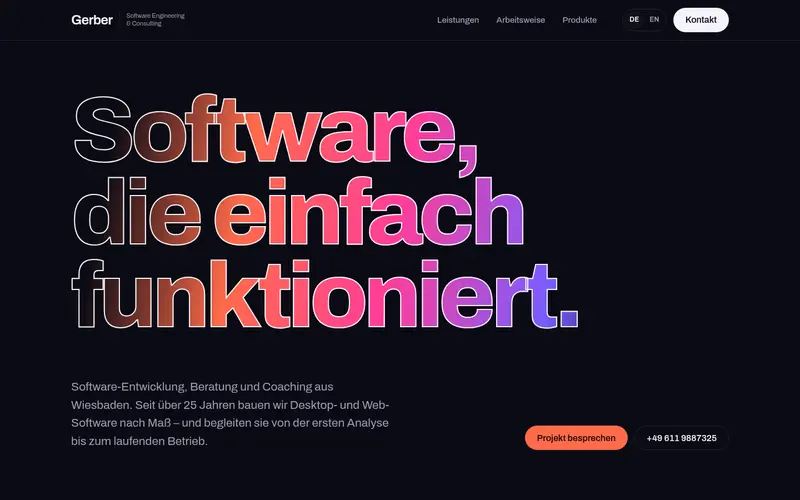
    Giant outlined headline filling the width, with a colour gradient sweeping through the letters. Dark.

  95. 096

    Diagonal

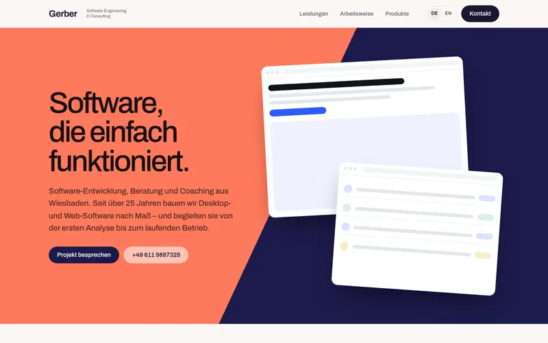
    The hero cut diagonally into coral and deep navy, with app windows on the dark side.

  96. 097

    Monogram

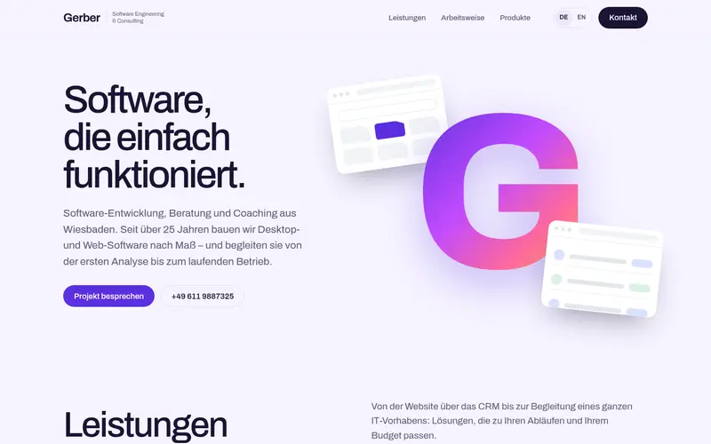
    A huge gradient “G” monogram with app windows emerging from behind it.

  97. 098

    Halftone

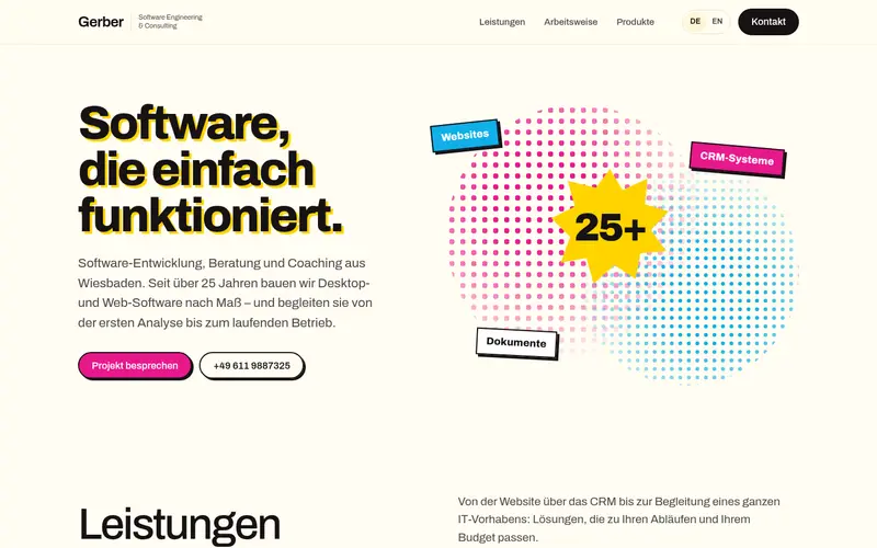
    Pop-art halftone dots, a starburst “25+” and tilted labels in magenta, cyan and yellow.

  98. 099

    Ribbon

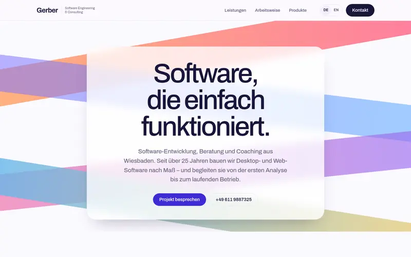
    Broad flowing ribbons of colour sweep across the hero behind a centred headline.

  99. 100

    Sketch

    A hand-drawn sketch: wobbly boxes, arrows and a circled note in blue pen on paper.

  100. 101

    Cover

    A magazine cover: GERBER masthead, cover image and cover lines like “25+ years of experience”.

  101. 102

    Bubbles

    Floating bubbles of different sizes and colours for every service and product.